Ever stared at your art and felt it was almost there — but something was missing? Many illustrators struggle with that last 10% that makes a piece pop.
Here are 4 tips simple, effective tips to make your digital art stand out using Procreate. Whether you’re working on lettering, illustration, or both, these easy techniques will help you add polish, clarity, and visual interest to any piece! Here are a few ways to elevate your illustrations quickly:
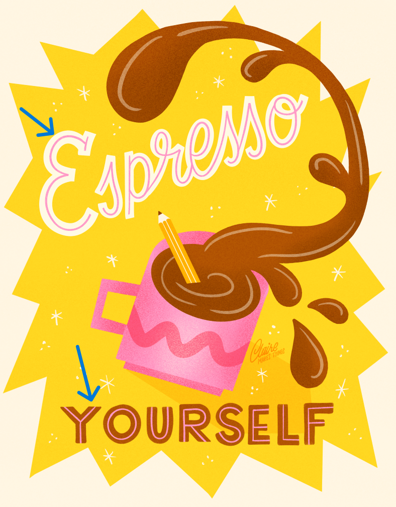
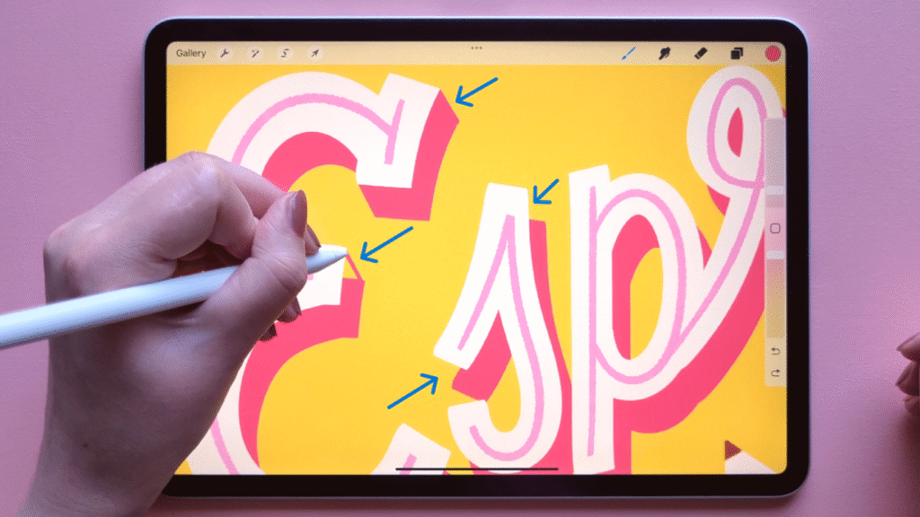
1. Add inlines to your letters
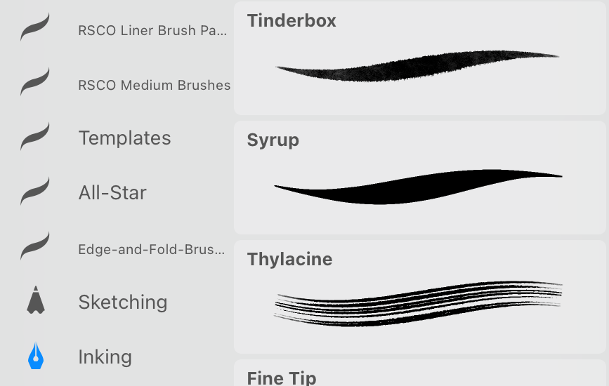
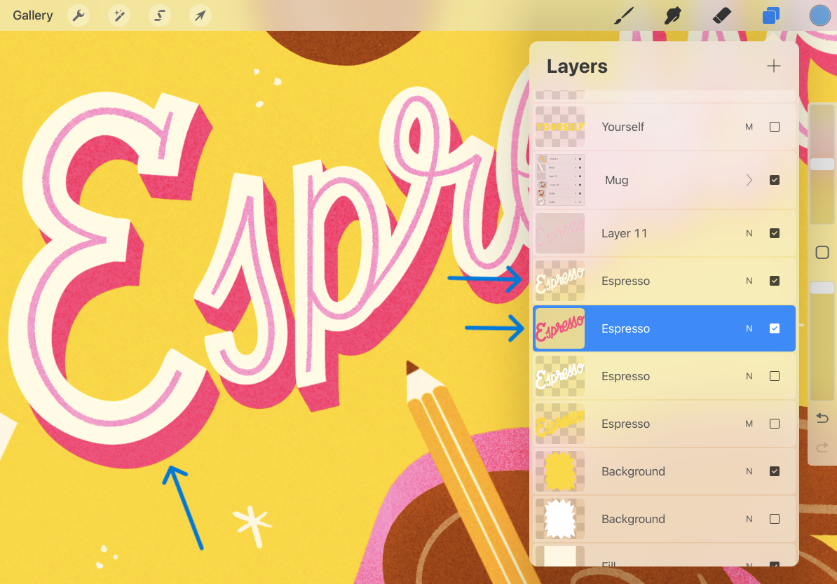
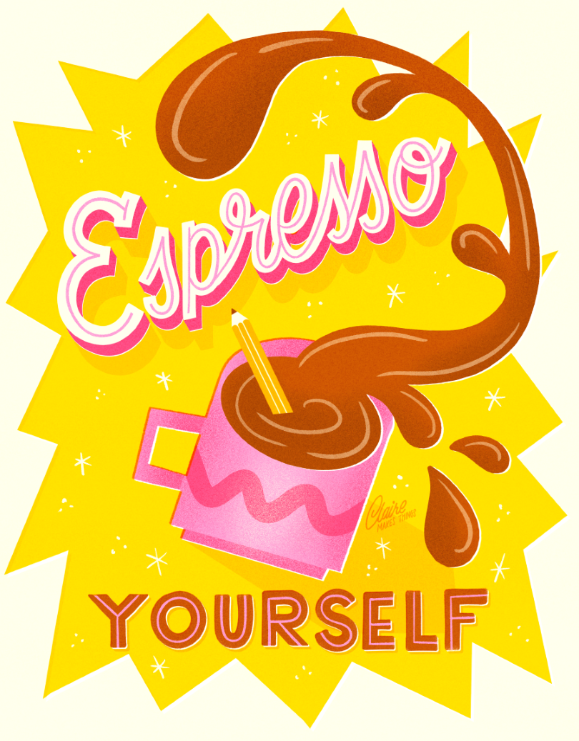
Letters with inlines have a thin stroke inside the letterforms, which adds contrast and breaks up heavier letters. This is also a great way to add texture, and reuse color in your letters. Use a liner brush with texture like the Tinderbox brush in the Inking Tab.
Don’t forget to add your inlines in a clipping mask on top of your lettering, so you can make changes independently of your letters.
Other brush options: The Liner Toolkit for Procreate
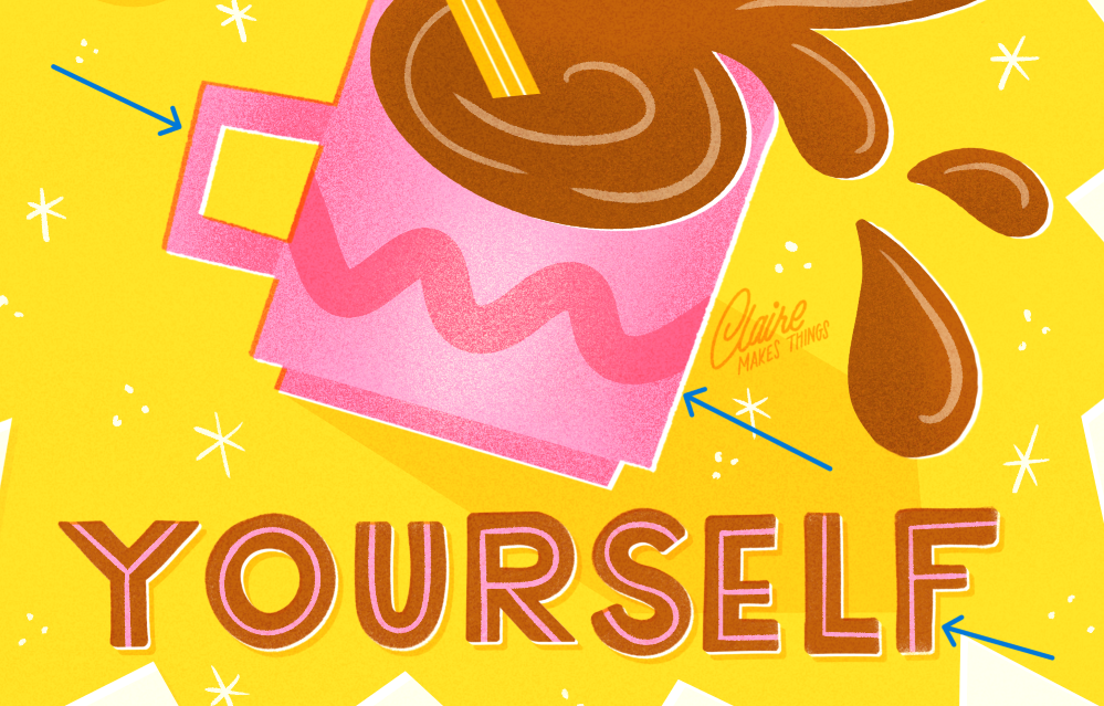
2. Add dimension
Without any shading or dimension in your letters or shapes, your art can feel a bit flat. You can easily add another dimension to your design by adding a 3D effect. This will make that part of your art more prominent and more dynamic.
To add this to your lettering for example, simply duplicate your lettering layer. Change the color of the bottom layer, and move it add an angle with the transform tool. Connect the two layers by connecting the corners with a similar brush on your bottom layer.
You can take this effect a step further by adding shading and highlights!
Related article: Procreate Power Tips: 5 Tips for Streamlining Your Creative Process
3. Dots, stars & Swirls
Tiny filler elements like dots, stars and flourishes are the easiest way to fill up the space around your main shapes or letters. They also add to the tone of your art (whimsical, quirky, retro) and break up big, bulky backgrounds.
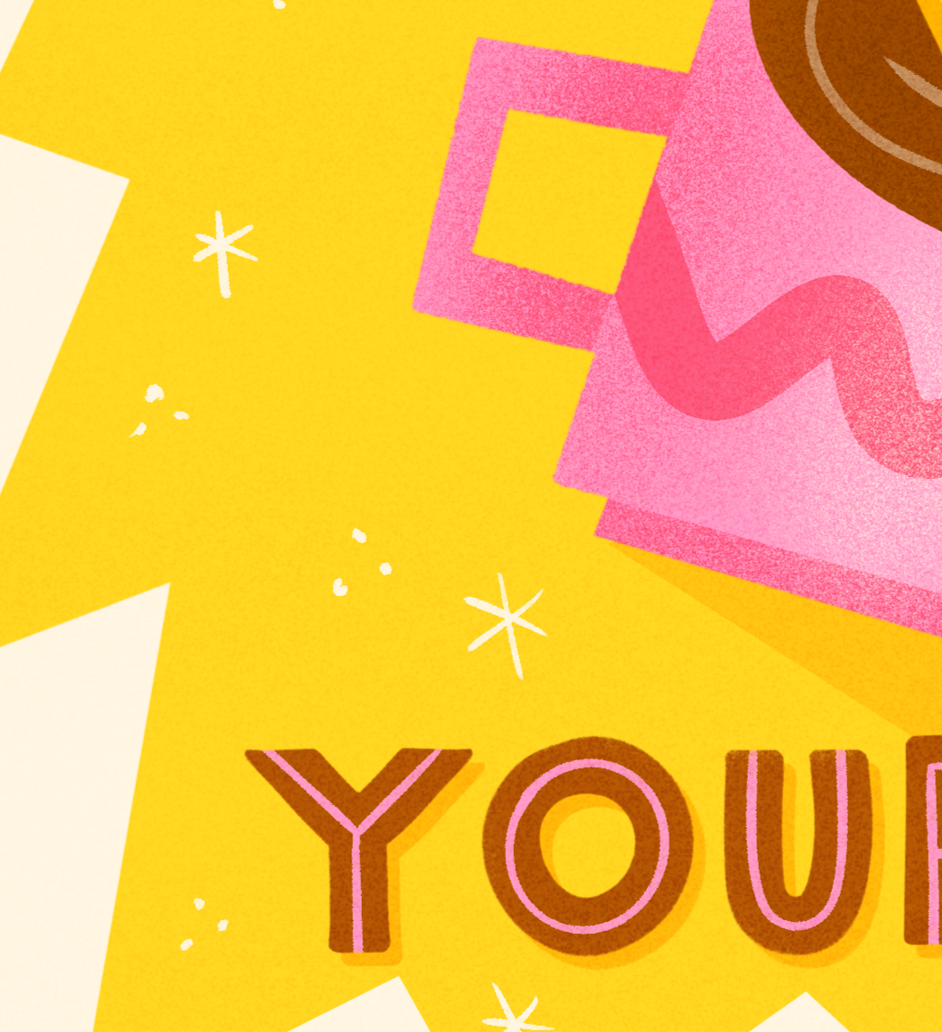
You can use stamp brushes for this (shapes you have saved in the Brush Library) or simply draw them by hand. Bigger flourishes stand out more, whereas small sparkles, dots or swirls create a sort of pattern and add to the overall look of your artwork.
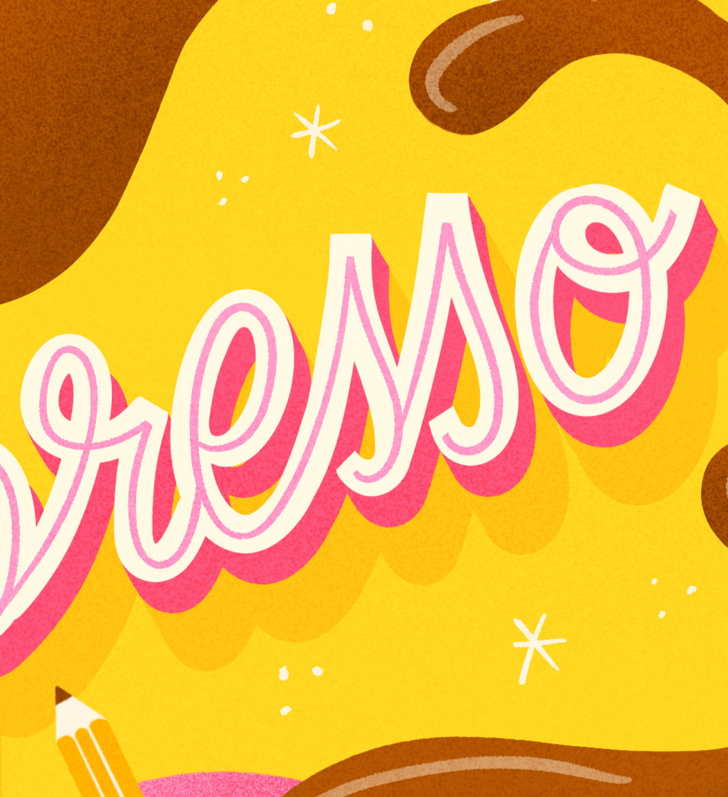
4. offset technique
Especially when using similar tones in your design, colors can kind of blend in to each other. An easy way to separate your colors and add contrast, is by replicating an offset printing effect.
This effect is a consequence from printing back in the day. Colors are printed separately, and when layers of color don’t line up perfectly, they overlap. This creates white edges on one side, and multiplied colors on the other side. This effect now adds a feeling of nostalgia and imperfection.
To recreate this, duplicate your layer, and turn your bottom layer to white. Move the white layer slightly, and change the blending mode of the top layer to multiply. You’ll see a slight white edge on one side, and blended colors on the other, as if the printer misaligned layers. This is an easy way to transform your art and give it a unique, retro look.
Related article: Retro Lettering Made Easy: 5 Tips to Add a Midcentury Charm to Your Designs
These are just a few of the things I teach in my new Skillshare class, where I walk you through how to take a decent illustration and make it amazing. If you’re ready to level up your art fast, come join me!
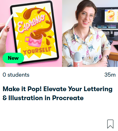
Ready to learn more? Elevate Your Lettering & Illustration in Procreate
In this class, you’ll learn 8 simple, effective tips to make your digital art stand out—without needing to start from scratch!