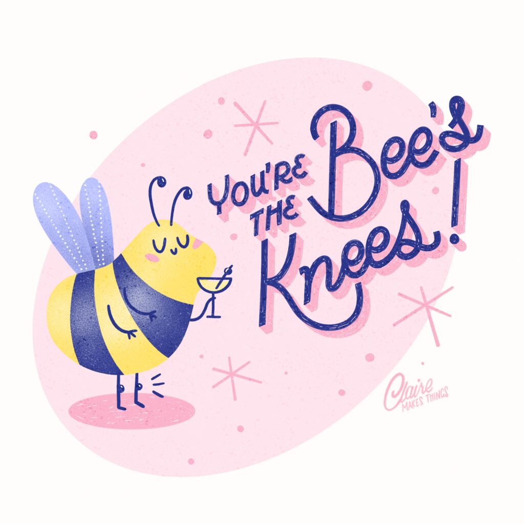
In this post, I’m answering the most common questions I get about Procreate lettering—from favourite brushes to nailing those perfect curves. Let’s talk lettering!
q1. How do I start my lettering project in procreate?
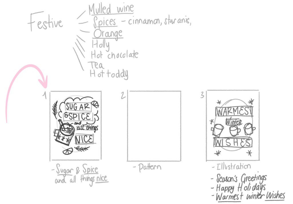
Always start with a BIG canvas size. This way, you can always use your work on a big scale and prevent quality loss. I like using a minimum of 2500 x 2500px or so. To start sketching and come up with ideas, start with thumbnail sketches. These quick, small drafts help you:
→Plan your composition and brainstorm ideas.
→Decide where to place important elements.
→Test different layouts for better readability.
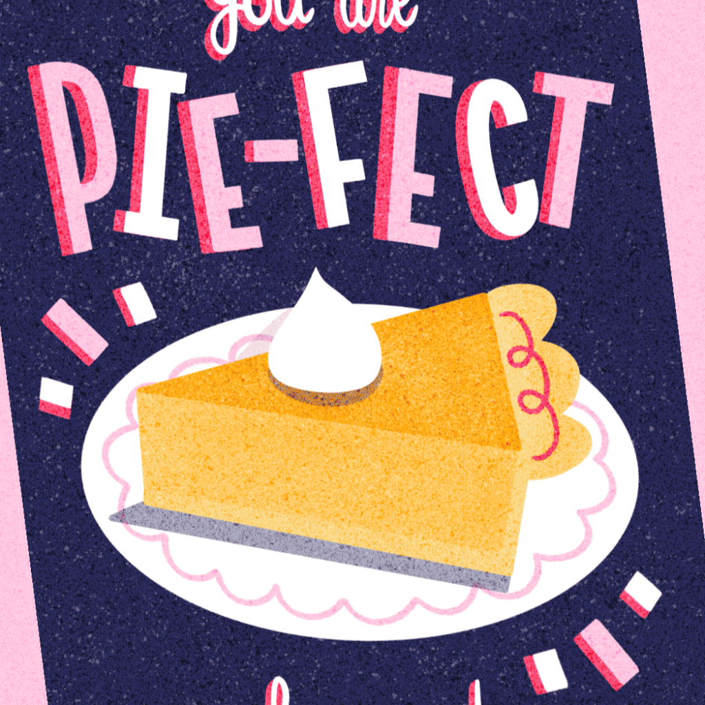
Especially when working with lettering, testing out compositions in thumbnail sketches is essential. Emphasize important words, especially in phrases or puns. Larger or bolder letters naturally draw the eye to key parts of your message.
Q2. Where do I find inspiration for lettering designs?
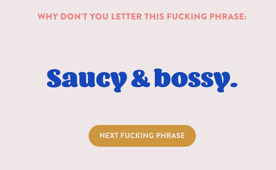
Pinterest, typography books and retro packaging! When it comes to fun phrases and puns I like to use for designs; I keep a long idea list of puns I want to use in the future. Here are a few useful resources to get your creative juices flowing:
→ WTF Should I Letter?
A pun and joke generator created by lettering artist Lauren Hom, perfect for finding inspiration.
→ Fonts in Use
An online library of typefaces used in real-world designs, including advertisements, posters, and packaging. You can filter by time period (e.g., 1960s) too.
→ Pinterest
Of course! Just search for “1960s fonts,” “midcentury ads,” “Atomic Age design”, or whatever you’re interested in. It is also the best place to save your ideas and favourite things from the internet. Retro Lettering & Illustration
→ Food & Beverage Holidays
National Maple Syrup day, International Tea day, Bacon Day. Make a design based on an upcoming holiday (think of a pun if you can!), always fun and very topical.
→ My Retro TV
I love retro inspiration. A fun one for finding old advertisements, cartoons and more on TV, back in the day.
Related article: Perfect Puns: 6 Tips for Short & Sweet Lettering with Wordplay
q3. How can I ensure my lettering layout looks balanced?
To make your lettering looks balanced, think about your composition and spacing. Start your layout with blocks, and make sure those are balanced first. Then, place your letters inside the blocks and space them evenly. To make things a bit easier, start with the outer letters and work your way inwards.
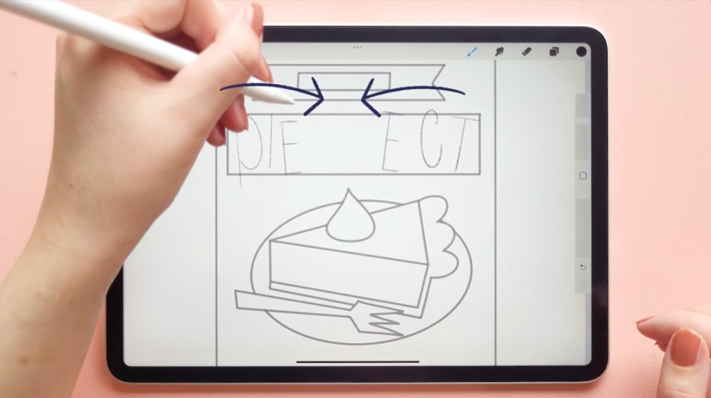
Don’t forget that you can use guides for structure. Procreate’s tools like gridlines, stamps, or pre-made layouts are lifesavers. I like saving layouts that work well for me as stamps and reusing them for multiple pieces. Use Procreate’s snapping feature to align your guide precisely.
Q4. How do i find my own style?
Practise! Keep trying out different lettering styles, from elegant scripts to bold serifs, to illustrative letters. Try to do drawing challenges that allow you to try something new every day or week for a while. You’ll quickly learn what you like and what you don’t like. ‘Finding your style’ in my opinion doesn’t really happen. But, you learn what works for you, and what sort of things you gravitate towards. Look back at your older work, and see what you enjoyed doing and what worked well for you; iterate that and keep practising!
Related article: 10 Skillshare Classes To Help You Improve Your Illustration Skills
Q5. what are some ways I can improve my lettering?
There are a few techniques you can try out to take your lettering designs to another level, or simply experiment with new styles:
→Mix different styles together; playful block letters with elegant script, retro serifs with brush letters, etc. You don’t need to control and perfect every style that exists; just find what you like doing most.
→ Try adding depth with shading and highlights. Duplicate your lettering layer, offset it slightly to form a shadow, and add highlights or inlines to give the design a dimensional effect. I love using this technique with big, playful block letters because it gives the letters more weight and instantly makes them more interesting.
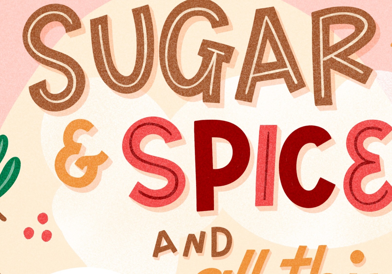
→ Consistency! This is far more important than perfecting your lettering. Set basic rules for your letters and stick to those to maintain uniformity. This makes your design seem much more intentional and pleasant to see. I tend to stick to playful, retro block letters, and practise it over and over again.
Q6. How can I add textures and depth to my illustrations?
I love adding textures to my lettering designs in Procreate. They’re perfect for setting the tone of your design, adding a handmade feel and adding depth to an otherwise flat design.
My favourite way of working is to start with basic, clean shapes, and add textures on top at the end. I always keep textures separate by using clipping masks, blending modes and masks, so that I can make changes if need be. You can also use textured brushes for your lettering to give it a more hand-drawn look. My favourite textures to use are grainy, speckled brushes that I can use on top of my entire design or all my letters. They give designs a chalky or aged look, perfect for printing, and a more tactile feel.
Related article: Mastering Textures in Procreate: 3 Techniques for Illustrators
Just keep in mind to not overdo it with textures. Try to stick to 1-3 different types in your lettering design; you usually don’t need more than that. When you want to use more texture, focus on clean, bold shapes that are easy to read.
Q7. What are your favorite Procreate brushes for lettering?
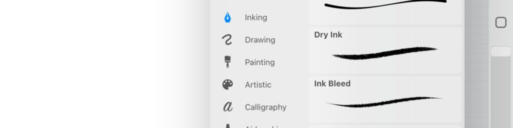
→ The Dry Ink brush: I love the texture of this brush and use it regularly. I created a few different versions of this one by changing the size and stabilisation.
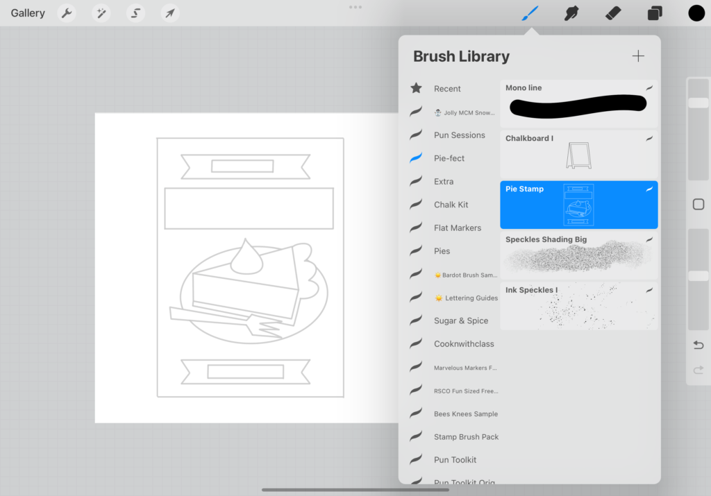
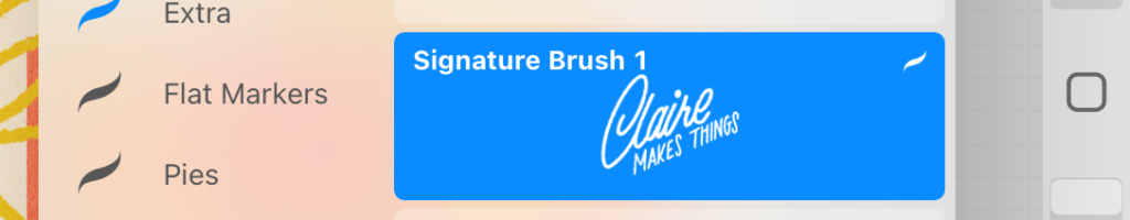
→ Stamp Brushes: I like to save everything from compositions, templates, small visual elements and more as stamps. These are also brushes, but instead of a continuous line, they are separate elements. They help with creating consistency in multiple designs, and make the drawing process a lot easier. I also have my signature saved as a stamp brush, I recommend it!
→ My Go-To brush set: The Pun Toolkit. I use this set of brushes for lettering a lot for my lettering designs. If I ever get lost or overwhelmed with choice; I know that this set has everything I need in terms of lettering help (the double monoline brush), textures at the right scale, and stamp brushes to finish off my work.
Having said that, you don’t NEED any other brushes to make great lettering designs, other than the default Procreate brushes. There are plenty of options already, and it’s more about how you use them than having the ‘perfect’ brush!
Q8. What if I’m not confident in my drawing abilities? Can I still do lettering?
Absolutely! I was introduced to the world of lettering by using brush pens and hand lettering. As someone who’s lefthanded; this was a messy process and I absolutely hated it, no matter how often I practised. I was convinced anything to do with letters just wasn’t for me. It wasn’t until I found the tools I love using (the iPad and Procreate, and chalk pens for lettering by hand) that I realised I could do this.
Don’t be discouraged if you can’t make it work for you the first time around. Experiment with styles, different tools and ways of working. Just because one way of lettering or drawing isn’t right for you, doesn’t mean you should throw the whole idea away.
Q9. Any final tips to make my design stand out?
→ Simplicity is key. Avoid overly intricate details. Don’t fill up your design with too many words or decorative elements. Remember that your letters must be legible; don’t overcomplicate your lettering to the point that it becomes impossible to read, especially when working on a small scale. You want to make the letters shine.
→ Never aim for perfection; embrace the playful, imperfect nature of lettering. Imperfections and quirks add personality and will help your work stand out. This is what makes your work uniquely yours!
I hope these answers were helpful. Good luck on your lettering journey!
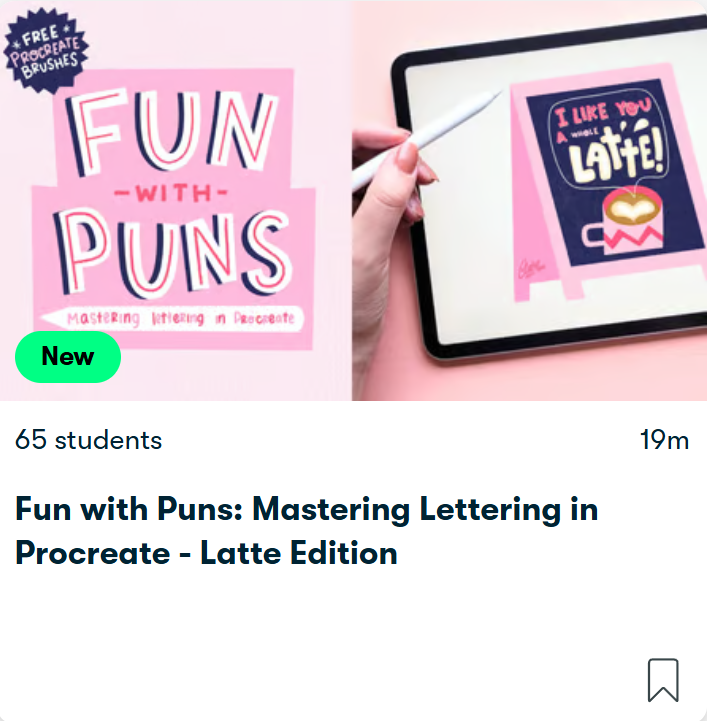
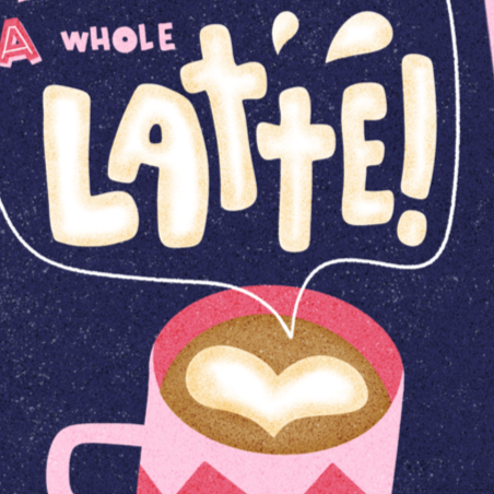
Fun with Puns: Mastering Lettering
in Procreate – LATTE Edition
Ready to learn more? In this short class, we’ll go over all these steps and more and create our own lettering design. Turn your favourite messages into unique greeting card designs!