As an illustrator, I find puns and wordplay to be a fantastic tool for visually communicating concepts in a fun and engaging way. Whether creating a playful greeting card or an eye-catching chalkboard design, puns can elevate your illustrations and make them more engaging. But what exactly are puns and how can they enhance your illustration style? In this guide, I’ll walk you through six tips to help you get started with drawing puns. Let’s taco ‘bout it!
What ARE PUNS?
A pun is a joke that uses wordplay, often exploiting words that sound similar but have different meanings. Puns have a rich history in literature, with renowned figures like Shakespeare, Oscar Wilde, and Roman playwright Plautus incorporating them into their work. There are different types of puns and wordplay, including homophonic puns (words that sound alike but have different meanings; ‘bee happy’), homographic puns (words that are spelled the same but have multiple meanings; ‘I shed a tear when I saw the tear in my favorite shirt.’).
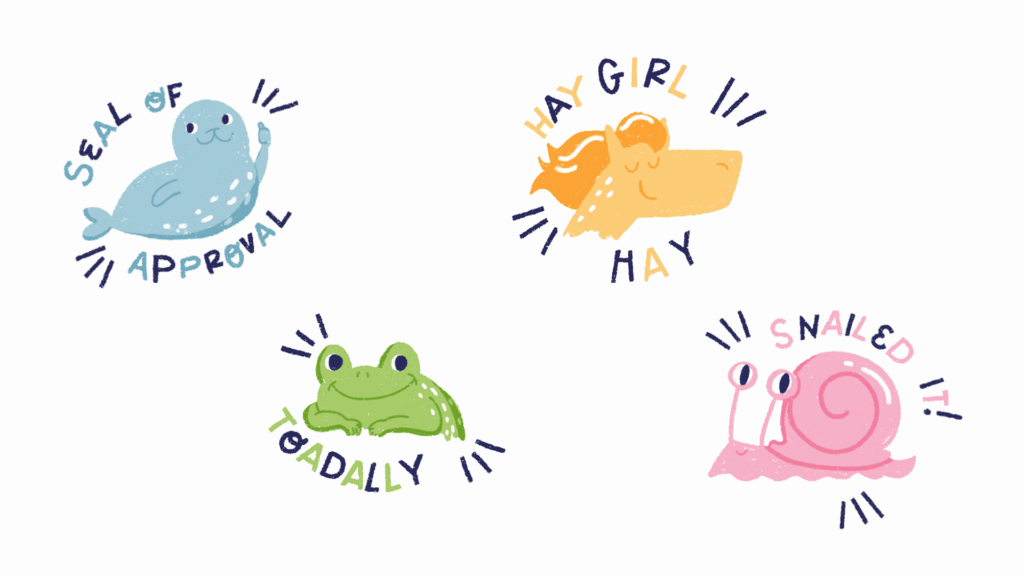
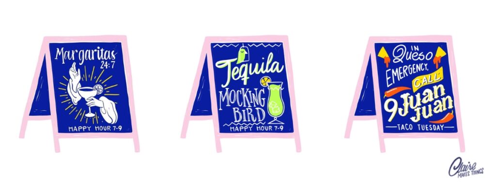
Puns are a great starting point for lettering designs because they’re memorable and universally relatable. That’s why you often see them on greeting cards, stickers, chalkboards, and more. Over the past few years, I’ve created menu designs, posters, branding assets and more for clients that include puns and wordplay regularly. They have made it easy to communicate with the audience and are a great way to make a memorable impression.
1. Develop Your Visual Language
When it comes to illustrating, it’s not just about how you draw—it’s about what you draw. You’re curating your own world, showcasing your unique perspective through your art. One of the most fun and creative ways to do this is by playing with puns because they can add a layer of humour, creativity, and originality to your work that can resonate with a broad audience. The way you interpret and visually communicate with humour and language can become a signature element of your personal style.
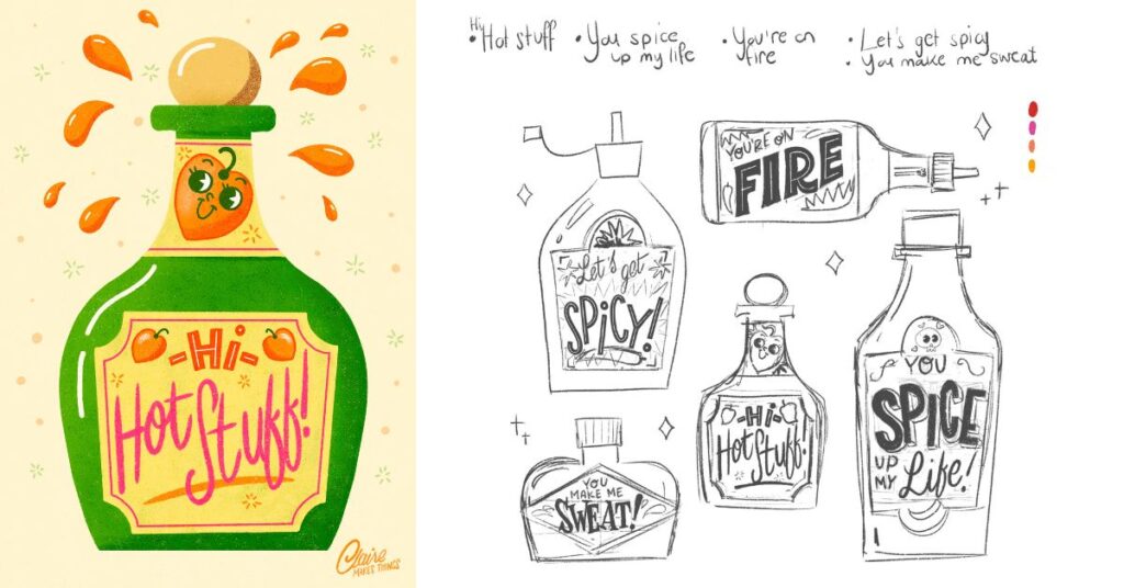
You can start by collecting puns and wordplay you like, research designs that include wordplay and sketch out ideas in thumbnail sketches. This allows you to try out lots of different options and ideas in a short time. Plus, working on a small scale helps you put words into compositions without focusing too much on details. Picking out ideas, brainstorming and sketching is a valuable process and will allow you to shape your unique point of view.
2. Think about Hierarchy
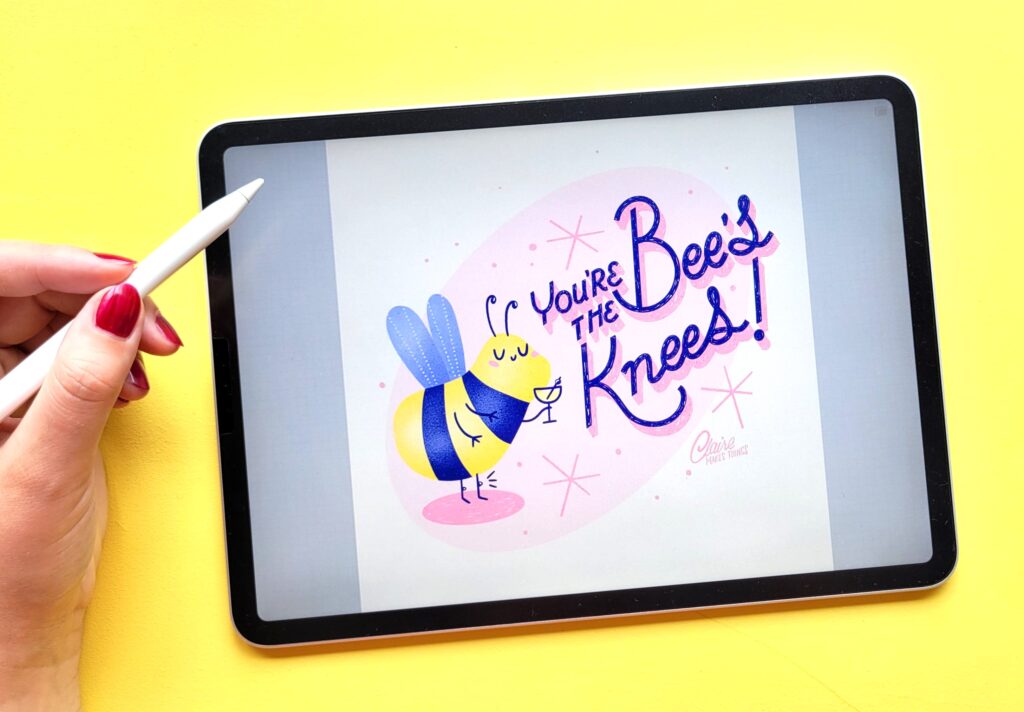
Hierarchy and composition are essential to illustrating with puns. Even in short lettering pieces, certain parts of the text are more important than others. In a pun, certain words or visual elements carry the punchline or key idea. Hierarchy ensures that these elements stand out, making the pun immediately clear and understandable. For example, in ‘You’re the Bee’s Knees’, the emphasis is on ‘bee’s knees’, because these two words are most important and have a double meaning. So ‘you’re the’ can be supportive and a lot smaller in your design, perhaps even in a different lettering style to differentiate the two parts of the pun.
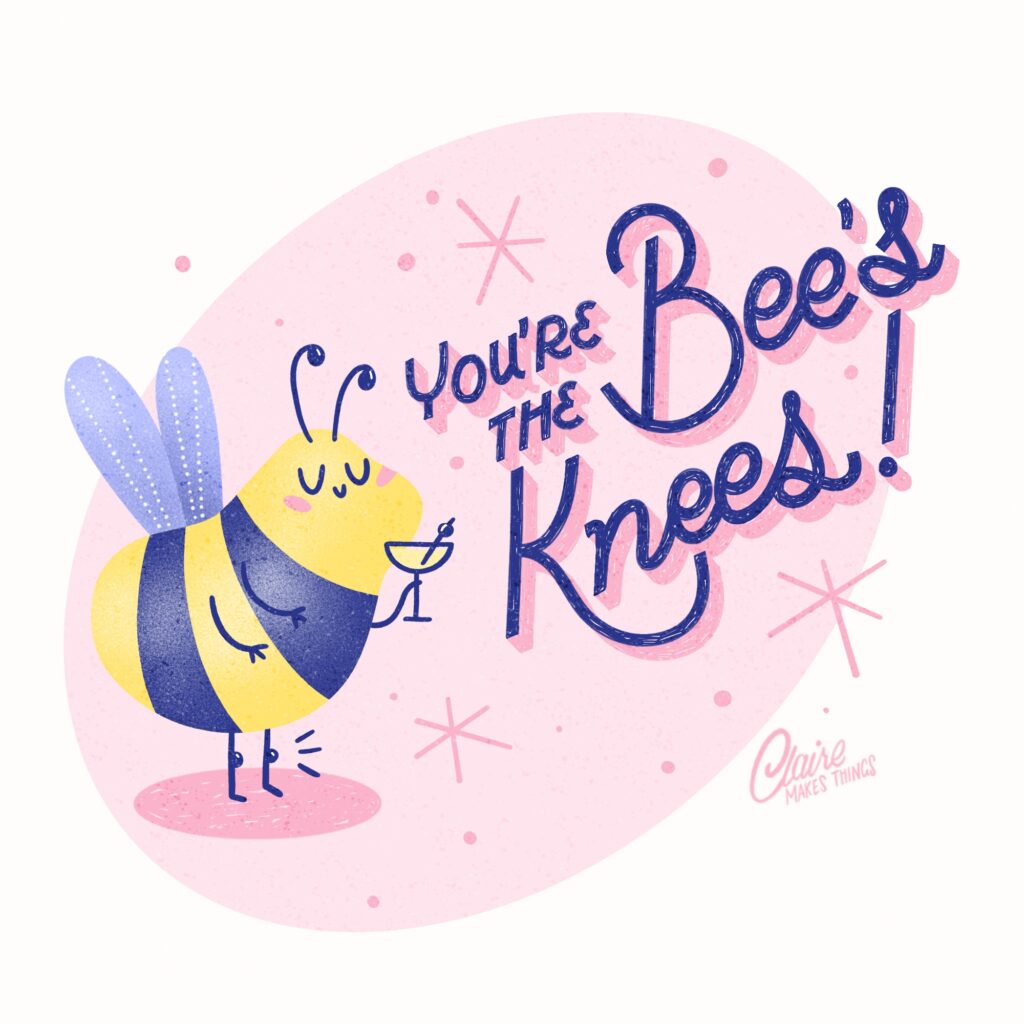
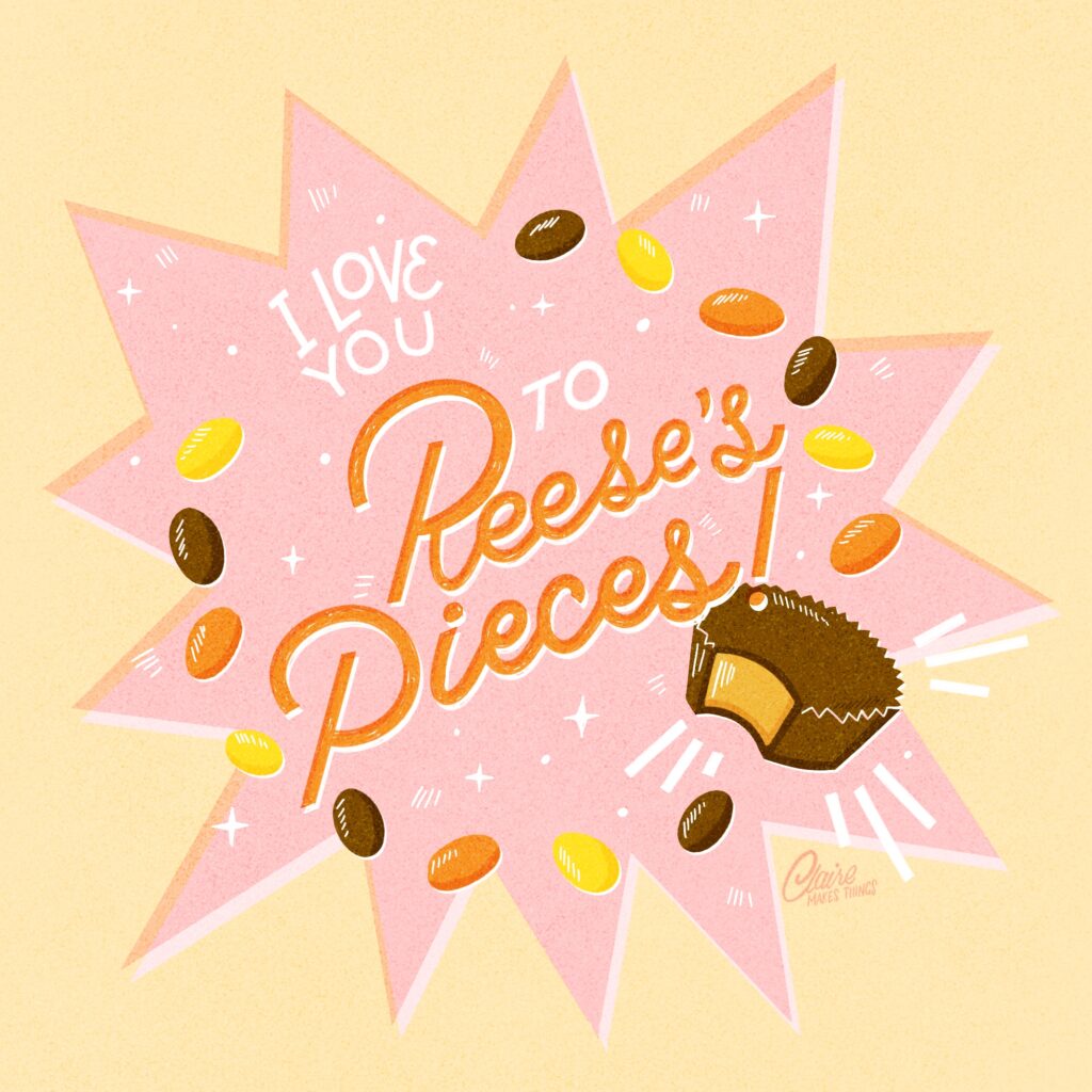
Think about how viewers read and perceive your design, and determine which elements of your illustration should stand out, to be able to understand the pun better. In essence, hierarchy is what makes a pun not just clever, but also easy to read, understand, and enjoy.
Related article: Mastering Lettering: 7 Tips for Illustrators
3. Get creative with visuals
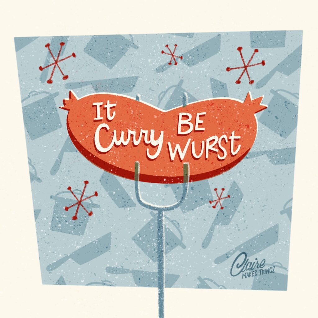
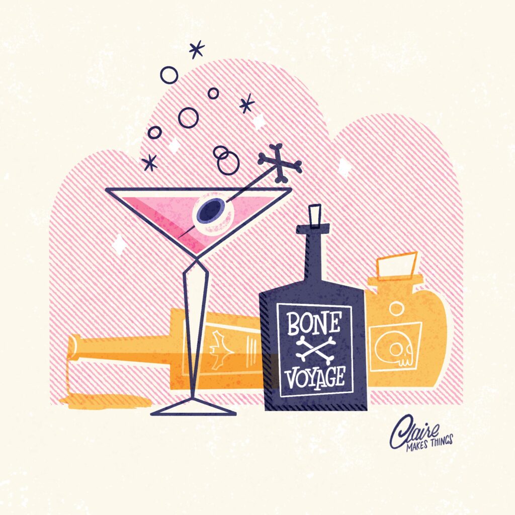
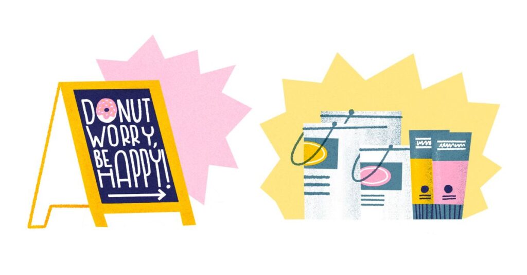
Try to combine lettering with visuals in a creative way; the lettering itself can become part of the pun. For example, the letter “O” can be replaced with a donut in a phrase like “Donut Worry,”. If you’re new to lettering or unsure where to begin, puns offer a simple and approachable way to practice. They’re typically short and sweet, making them easy to work with and perfect for combining with visuals too, even if you don’t have a lot of experience with lettering. Try sketching on a regular basis and practice coming up with new ways to visualize puns quickly.
4. Keep it simple
Simplicity often makes puns more effective. Don’t fill up your design with too many words or decorative elements. The audience needs to understand right away and they might have to understand multiple meanings all at once. Especially when working on a small scale like greeting cards, too many elements will make it impossible to read and understand your design.
Remember that your letters must be legible; don’t overcomplicate your lettering to the point that it becomes difficult to read. My favourite tool for creating illustrations is Procreate. Even though the options in apps like Procreate are endless, it’s easy to overdo it with lots of textures, different brushes and adding lots of elements. While it’s fun to get creative, ensure that your puns and wordplay are still legible and understandable.
Related article: How I Create a Greeting Card Collection in Procreate
5. Keep the Imperfections
Remember, your illustrations don’t need to be perfect (perfection doesn’t exist!). Once you’ve conceptualized the idea, you’ve already done the most important part. The beauty of puns lies in their simplicity and silliness, so keep that in mind when creating your designs. Use the quirkiness and humour and let that shine in your own unique way in the illustration too. Imperfections and quirks add personality and will help your work stand out. To find that ‘quirkiness’ in your work, look back at your older designs and see what stands out; what ‘mistakes’ have you made that are inherently part of how you draw. For me, it’s wonky lines and letters!

6. Keep creating
Lastly, don’t give up. By committing to the learning and discovering process, you’re not only creating art, but you’re also refining your ability to generate and develop ideas. Each attempt teaches you something new, whether it’s about your style, your creative process, or even just the discipline of seeing an idea through to completion.
So, pick those puns, embrace the imperfection, and commit to the process. Your unique take on wordplay is what will make your art truly stand out!
Short & Sweet Lettering in Procreate
Ready to learn more?
Learn how to combine illustration with lettering with puns! Lessons include:
•Choosing the right idea for your next puntastic project
•Essential tips on composition
•Building your lettering from scratch to finish
•Developing your egg-cellent final illustration piece
•Tips to improve your creative process
I loooved this class! Packed with amazing tips, straight to the point and super fun to follow along. And the brushes from the resources were really helpful!
— THAIS
Are you not on Skillshare yet? You can check out all of my classes using the free 1-month trial: Join me on Skillshare here to access all of these classes + lots more. This post contains affiliate links. This means if you buy something (like a Skillshare membership) through one of these links, I get a commission at no cost to you!
Subscribe to my monthly newsletter for regular updates:

