
Retro lettering from the 1950s and 60s has a timeless charm that makes any design feel warm, nostalgic, and full of personality, which is why I love it so much. Whether you’re designing a greeting card, a poster, or patterns, mastering midcentury-style lettering can give your work a unique feel.
In my new Skillshare class on midcentury lettering, I dive deep into this style, covering how to create a playful, vintage-inspired card with a humorous twist. But even if you’re not designing a card, these five key tips will help you bring retro flair to any digital lettering project.
1. Study Midcentury Lettering Styles
Midcentury lettering styles are often bold, whimsical, and often hand-drawn. They were heavily featured in advertisements, logos, cartoons and more. Some common styles include:
- Sans-serif block lettering – Think of diner signs and classic advertisements. Playful, easy to read, and fun to add to lettering designs.
- Playful script – Loopy, friendly, and full of movement. Works great on its own, but also in combination with other sans-serif lettering styles.
- Expressive serif lettering – Featuring big, pointy serifs and lots of sharp corners. It is eye-catching and iconic of this time.
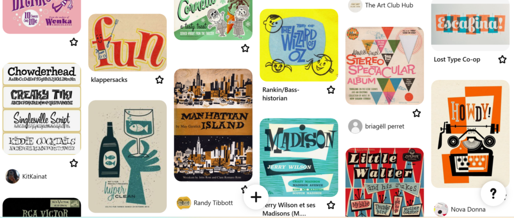
A great way to get familiar with these styles is to look at vintage ads, packaging, and signage. Pinterest and old magazines are excellent resources!
→ My Midcentury Fonts Pinterest Board
Related article: Mastering Lettering in Procreate: Answering Your Questions
2. Exaggerate Shapes and Imperfections
Unlike a lot of modern digital fonts, retro lettering often embraces slight inconsistencies. The nostalgic and warm feel of these letters work perfectly on greeting cards too. To capture this handmade feel:
- Stretch or squash letters in a fun, organic way.
- Add playful curves and angles to straight lines.
- Keep some letters slightly misaligned to add charm.
Keep in mind that your lettering should always be legible first. Experiment with lettering, but make sure to not overdo it!
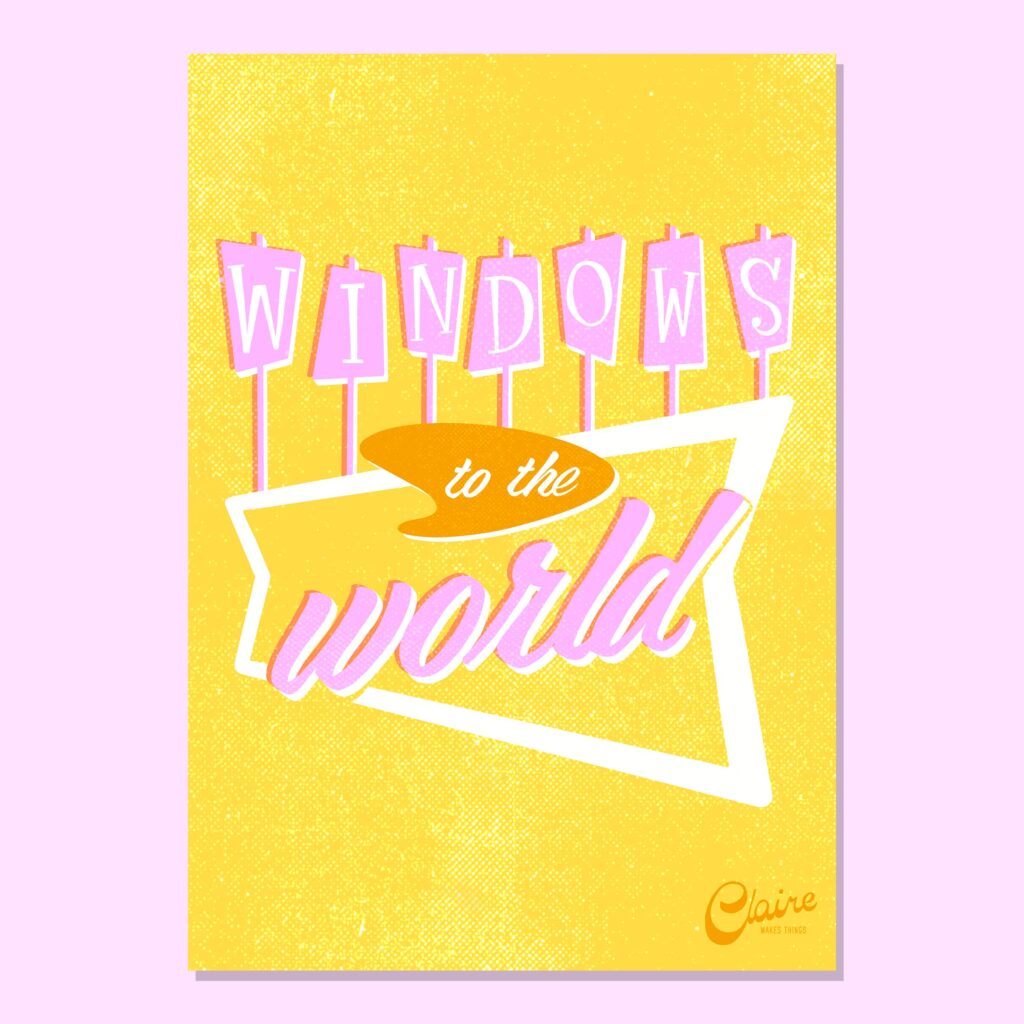

3. Use a Limited, Vintage-Inspired Color Palette
Color palettes during this time vary from decade to decade. It started a bit more desaturated and monochromatic, and they later evolved into more saturated and playful and vibrant, but still often a minimal color palette because printing was still pretty expensive. So designers tried to find ways to use that minimal color palette with textures and, for example, half tones to be able to expand what they can show on paper. They used mostly:
🎨 Minimal color palettes
🎨 Vibrant colours, muted blues, teals, and soft pinks
🎨 Cream or off-white backgrounds instead of pure white
Stick to a minimal color palette and try using textured brushes, subtle grain and halftone textures to mimic the look of old print materials.

4. Play with illustrations and stamps
If you want to set the tone of your digital lettering piece, experiment with fun filler shapes like sparkles, stars, dots and more. This will make your design more dynamic, help you balance out empty spots around your letters and give your work an instant retro feel.
✨ Add stars, sparkles or dots to give your design a midcentury feel.
✨ If you’re using Procreate, you can save these small illustrations as stamp brushes to be able to easily reuse them.
This is especially great for greeting cards, where a dynamic layout can enhance the message.

Related article: Mastering Textures in Procreate: 3 Techniques for Illustrators
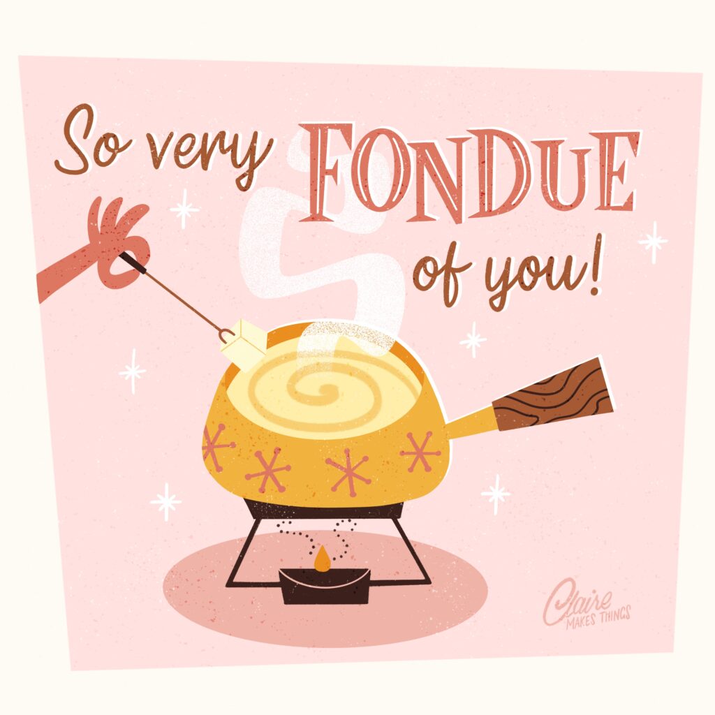
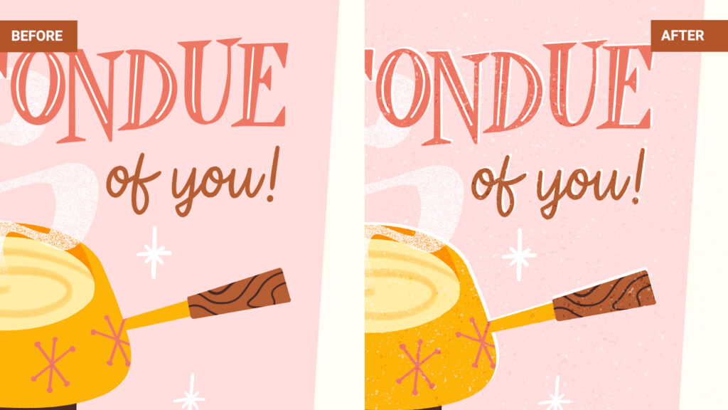
5. Add Midcentury-Inspired Textures and Effects
To complete your retro lettering design, finish your lettering with effects that mimic vintage printing techniques:
- Use halftone shading for a screen-printed look (use a Procreate halftone brush for this).
- Add slight misalignment or offset shadows for a hand-printed feel (add a layer of white underneath your letters).
- Apply paper grain textures to make your design look aged (create a separate texture layer and experiment with blending modes).
These final touches can really bring your lettering to life and give it a special, midcentury feel. In the lettering piece below I added an offset effect (white layer underneath my lettering and illustration) and added a speckled texture on top.
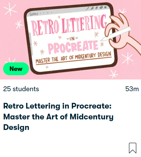
Retro Lettering in Procreate: Master the Art of Midcentury Design
In this class, we’re diving into midcentury style to create unique lettering designs, and I’ll teach you my step-by-step process for illustrating midcentury-inspired lettering!
This validated my doubts of making not so perfect lettering. Pretty eye opening and a fun class overall. Thanks Claire!
— DAKSHA