
Chalk art has a nostalgic charm that takes us back to childhood doodles on sidewalks and hand-lettered café boards. But what if you could bring that same organic, dusty texture into your digital illustrations? Whether you’re a seasoned illustrator or just exploring textures, chalk effects can add warmth, personality, and a handmade feel to your art.
Why Use Chalk Textures in Digital Art?
Digital art often leans towards a sleek, clean look, but textures can make your work feel more natural and inviting. Adding texture to digital lettering and illustration doesn’t just make it look more authentic—it also adds depth and personality. Chalk textures, in particular, give illustrations a playful, tactile quality. They’re perfect for:
- Lettering – Mimic the look of real chalkboard signs and old-school lettering styles.
- Illustration – Add a soft, grainy touch to shading and textures in bright, contrasting tones.
- Backgrounds – Create depth and interest without overpowering the main subject.
Related article: New Tutorial: Letter with Me in Procreate 🍹
How to Create Chalk Textures in Procreate
I love using Procreate for my digital chalk and textured illustrations. If you want to achieve an authentic chalk look, here are some key techniques for Procreate:
1. Use the Right Brushes
The brush you use makes all the difference. Look for digital brushes that mimic real chalk. Here are some of my recommendations for Procreate:
🖌️ Soft, grainy brushes for light, dusty strokes.
For example, the 6B Pencil in the sketching tab.
🖌️ Dense, textured brushes for bold lettering.
For example, the Dry Ink Brush in the inking tab.
🖌️ Dusty brushes to create a natural chalky blend
For example, the entire charcoals tab.
(If you want to skip the search, I have a chalk brush set for Procreate that’s ready to go!)

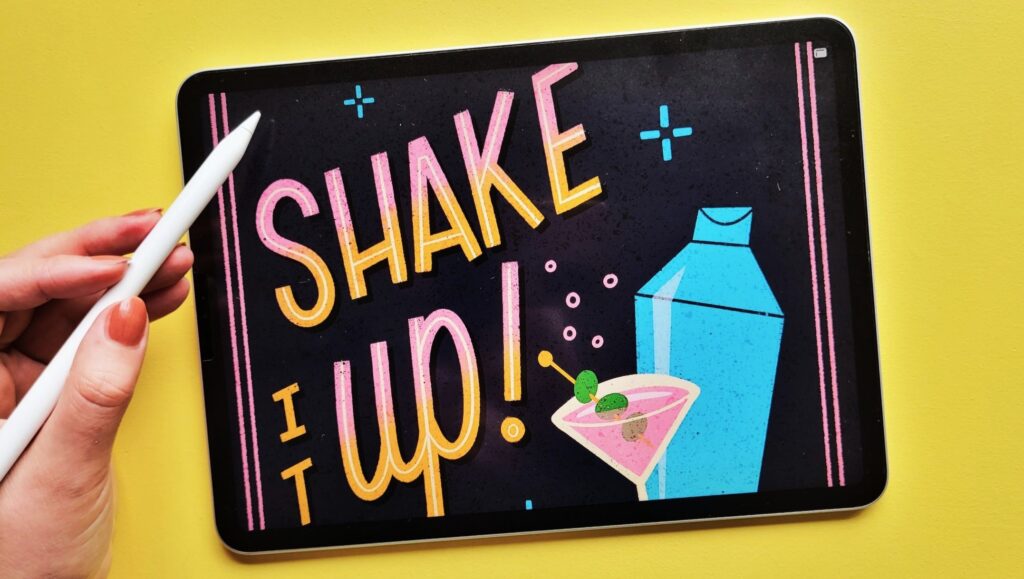
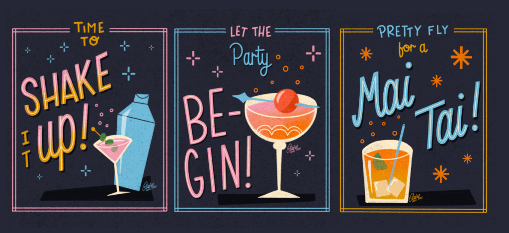
2. CREATE CONTRAST WITH COLORS
The best thing about creating chalk designs is the vibrant colours and the contrast the light on dark provides. Play with the contrast you can create with your dark tones and bright colours on top (see design above!). You can create by adding an even darker tone than your background to create shadows behind your lettering and illustrations.
Related article: Mastering Textures in Procreate: 3 Techniques for Illustrators
3. Play with textures
A dark, textured background (like a subtle grainy blackboard) makes chalk effects pop. Try adding a noise texture to simulate real chalkboard dust. Experiment with:
💡 Surface Textures – Applying a chalkboard or rough paper texture underneath your layers adds realism and depth. Use separate layers on top of your design, and play with the blending modes, to achieve an even chalk tone on top of your illustrations.
💡 Dust & Imperfections – Adding tiny chalk dust specks or slight inconsistencies in strokes makes the piece feel more natural and less digitally perfect. Remember to use the same texture in your eraser when removing bits!
💡 Limited Brushes per Design – Stick to no more than 1-2 different textures per design, as you don’t want to mix too many different textures and overcrowd your design.
Chalk Textures for more than just chalkboards
While chalk lettering is popular, don’t limit yourself! Try using chalk textures for:
- Illustrated Recipes – A playful, hand-drawn look
- Vintage-Inspired Posters – Chalk effects work great for retro designs
- Children’s Book Illustrations – Soft textures add a whimsical feel
Ready to learn more?
If you’re excited about adding chalk textures to your digital illustrations, check out my Skillshare class on digital chalk textures! I’ll walk you through the process step by step, from brush selection to final details.
