
Learn how to illustrate a pun with a retro look in Procreate. In this tutorial, I’m going to show you how to illustrate a retro styled pun using The Pun Toolkit for Procreate. So grab your iPad, make your favorite cocktail, and follow us along in these six easy steps. Let the gouda times roll!
STEP 1. Pun INSPIRATION
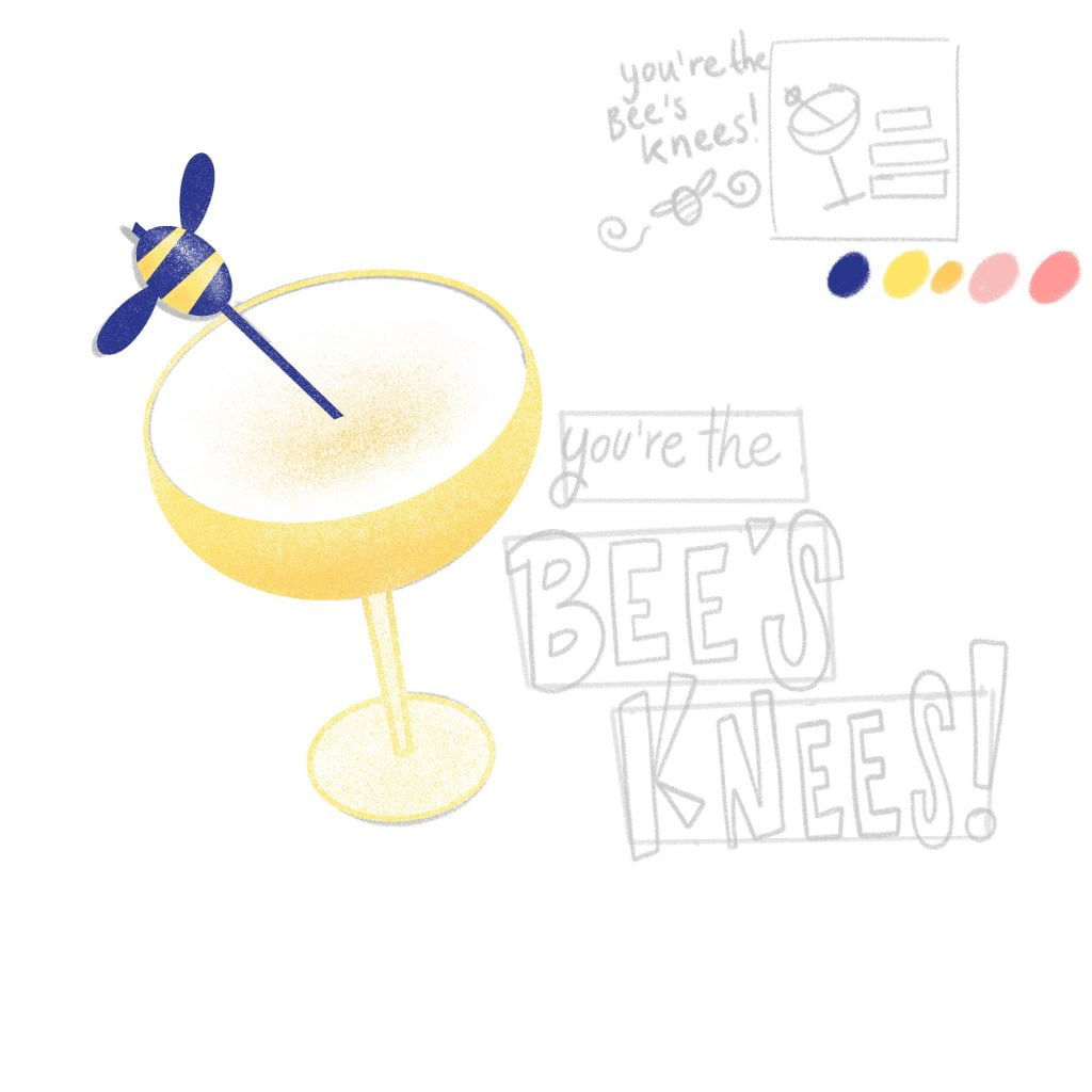
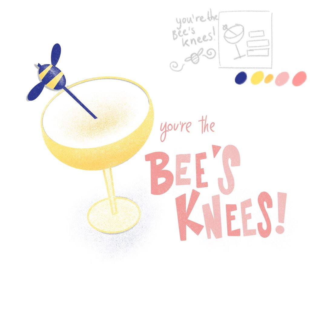
Firstly, let’s pick a pun. Puns and wordplays are perfect for creating fun illustrations with a short, but sweet message. The ‘Bee’s knees’ is a delicious, classic 1920s cocktail (with gin, honey and lemon), but saying something is the bee’s knees also means something or someone is excellent (especially in the 1920s, they had all sorts of nonsense catchphrases!).
So, we’ve got something with a double meaning we can put together. We’re keeping it simple by illustrating the cocktail and the phrase ‘You’re the Bee’s Knees’, which will make an adorable postcard, or part of a delicious cocktail menu with a retro look (if you want to draw a bee with a pair of fancy knees, please please please do! Here’s my version).
Some Bee’s Knees Cocktail Inspiration on Pinterest
💡 Puns and wordplays are memorable and fun; that’s why they work so well on greetings cards, as stickers, on chalkboards and more. Looking for more pun inspiration? Download my puntastic guide with more drawing tips here. Espresso yourself and make things! ☕
STEP 2. Sketching in Procreate
We’ll start with a thumbnail sketch in the corner of our canvas. This will be a handy reference while we make a sketch that will fit our canvas size. Think about composition and breaking up your text into blocks. Don’t forget to look at the negative space around your objects instead of focusing on the objects alone. Keep it simple!
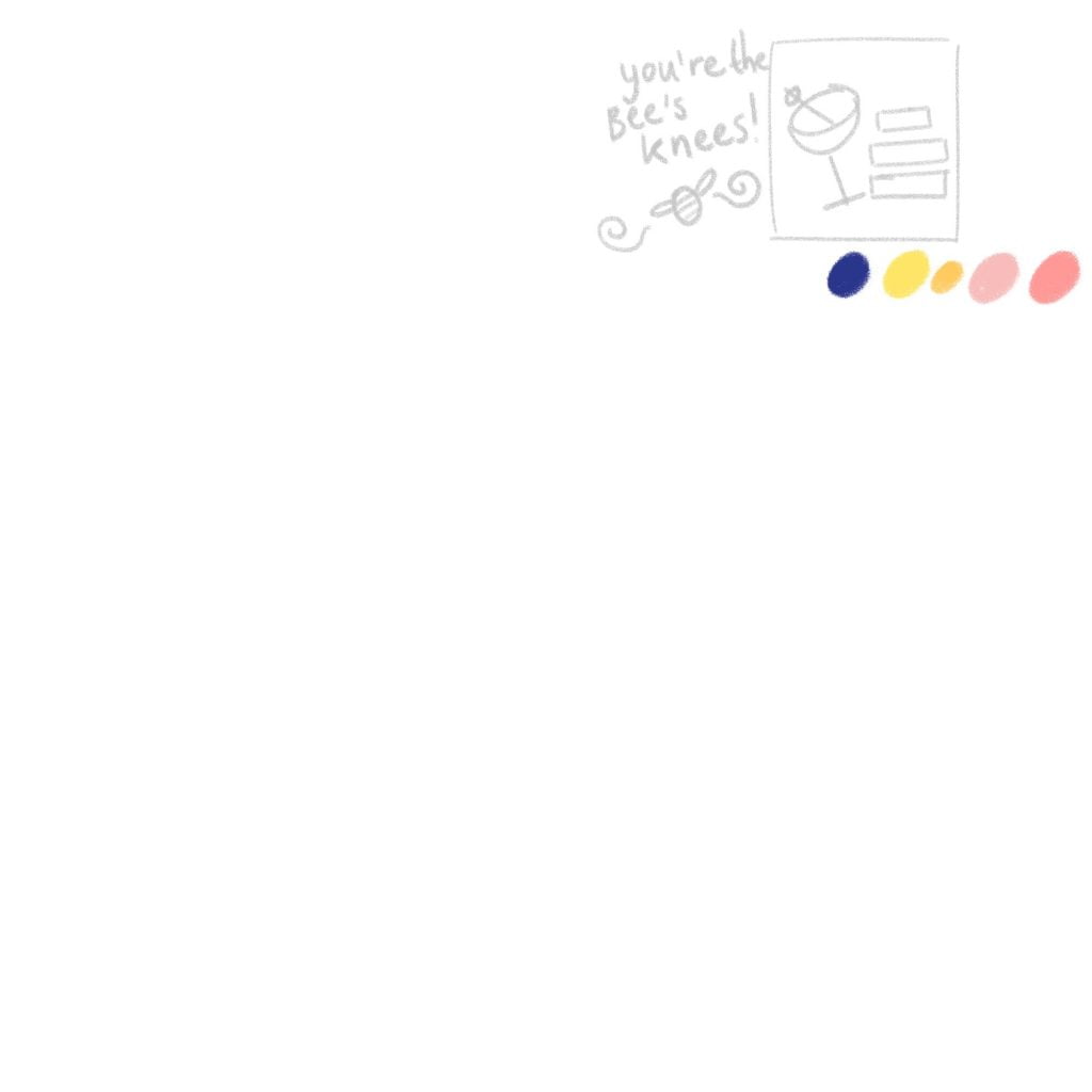
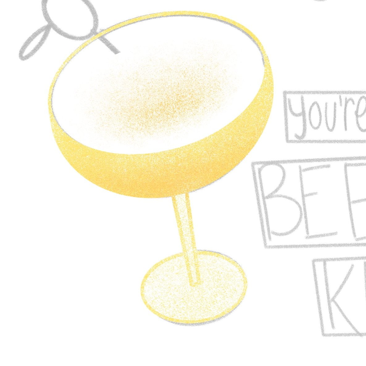
After that, let’s draw our cocktail glass. I like using the ‘messy sketch’ brush for this, which is my favourite brush for sketching and creating textured lines. Also add blocks where your text will go, this will make it easier to place our letters.
💡TIP: To create shapes with straight lines, just draw your shape and hold down with the pencil to make the lines perfectly smooth. Holding down a finger on the screen will create a perfect shape like a circle, rectangle or square.
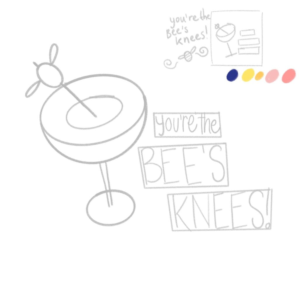
STEP 3. Cocktail glass + texture brushes
Create a new layer and trace the shapes of our cocktail glass. I’m using the ‘shape pen’ for smooth lines, that we can easily fill in with colour (if you’re using a heavily textured brush, filling the shape won’t be as smooth as it most likely will leave some gaps). Notice how not all shapes are filled in; a glass is transparent, so we’re really only filling the parts that hold our liquid (for contrast; the circle inside the glass will be white).
💡TIP: To create a retro effect and add some visual interest, we want to add grainy and speckled textures to make our illustration look aged. In addition, we can use textures to change colours slightly or create depth.
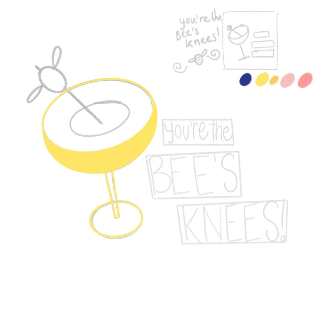
Secondly, on a new layer, we’ll add some texture. With the ‘chalky brush’ in white, I’m adding some grainy texture to the glass to brighten it up and give it some depth.
With the ‘sandy brush’, a slightly looser, grainy texture, we’re giving the stem and foot of the glass a bit of colour, as well as the liquid in the glass.
💡TIP: Want to add details inside your shapes? Use a clipping mask to draw inside the shapes without drawing directly on your objects (this way you can make changes later).
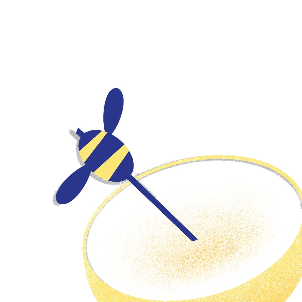
STEP 4. The bee’s knees
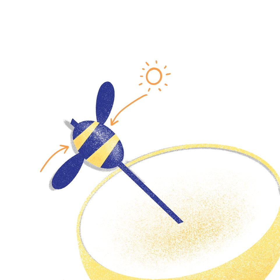
Let’s draw our bee cocktail pick, the same way we did the glass. Lines first, fill in with colour after. Then, on a new layer (as a clipping mask), use the chalky brush to create highlights. Think about where your highlights (in white) should be and where your shadows should be (a darker blue, and orange for the yellow stripes). The grainy texture helps to keep it looking retro, instead of giving it a very sleek, glossy finish.
💡TIP: Draw a sun / lightbulb on your canvas in the top left or right corner, so you’ll know where exactly the highlights and shadows need to go. This will be your reminder whenever you add textures to your shapes to create depth.
STEP 5. letters
Let’s sketch the shape of our letters, using the layout we sketched out earlier as a reference. The most important words, ‘bee’s knees’, are biggest and boldest, while ‘you’re the’ can be smaller. Draw the outlines of your bold letters first, using mostly straight lines and imperfect angles, to create these funky letters.
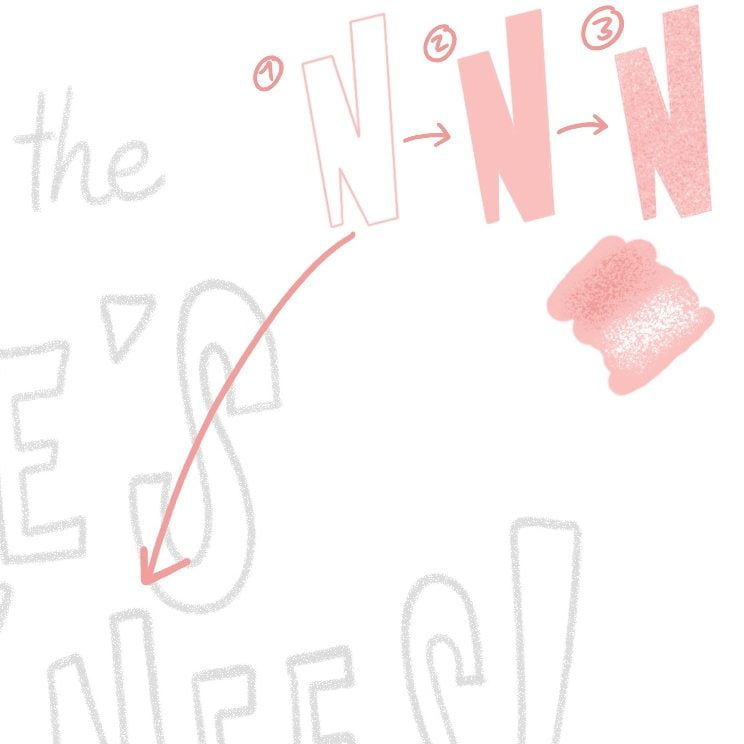
Fill the letters with colour, the same way as our shapes. I’m using pink in two different shades, to make our letters more playful. Finally, let’s add some grainy texture on top.
Let’s add that same texture to the bottom or our glass to create a bit of shading, so our cocktail glass doesn’t float!
STEP 6. We’re on a roll!
Lastly, let’s add a few finishing touches to finish our pun. We’re adding some details to our bee with the ‘dotted line’ brush, to make it a bit more dynamic and add some pink to our cocktail. Use the ‘midcentury stampbrush’ as a filler element in the empty space on our canvas and give our illlustration a more retro look.
Lastly, let’s add a very light pink to our background and use the ‘speckles’ brush to give your background a retro, aged texture. And of course, don’t forget to sign your work.
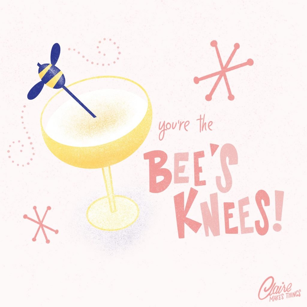
Our retro pun is finished! This is how to illustrate a pun with a retro look in Procreate. Don’t forget to share it with the world and tag me: @claire.makesthings. I’d love to see what you’ve made. Need a bit more help? Donut worry 🍩, here is a timelapse in Procreate so you can follow along:
Get the brushes in your inbox
Sign up for my email list to get the resources in your
inbox and draw along. I send out resources for artists & tutorials. You can unsubscribe anytime.
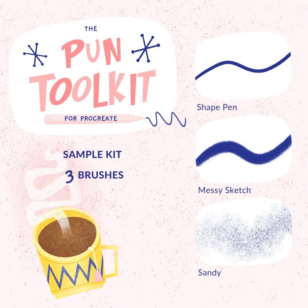
Get all the brushes + a drawing guide on how to illustrate a pun with a retro look in Procreate over here:
💡 Are you making a Procreate illustration that’s totally the Bee’s Knees with the brushes? 🐝 Send me an email or tag me on Instagram to get featured in my newsletter: claire@clairemakesthings.es